Retina: Scaling precision across print and digital
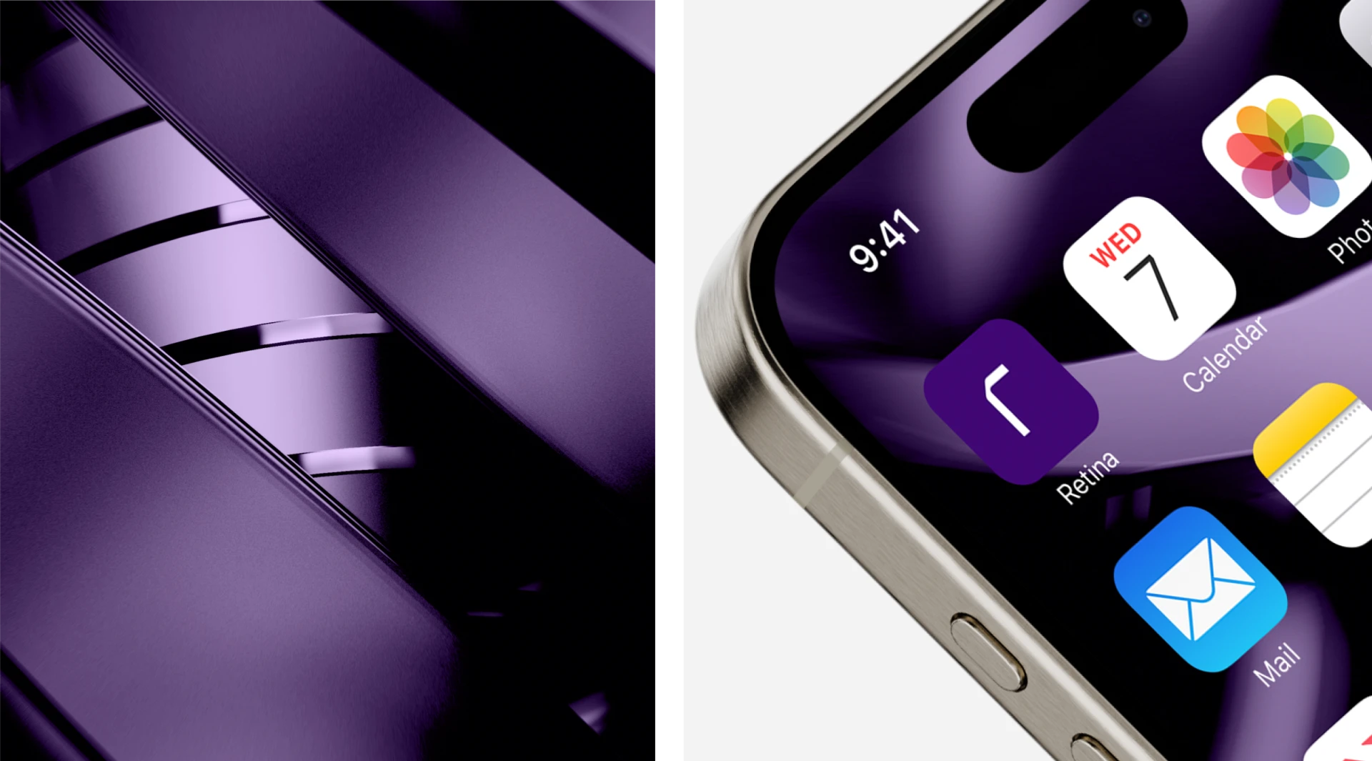
Retina's visual identity was born digital - bold, neon, 3D photography that worked on screen. But when the brand moved into print, the system broke. Full-bleed imagery became overwhelming. Pantone printing couldn't match the digital precision. The identity needed to translate without losing its edge.
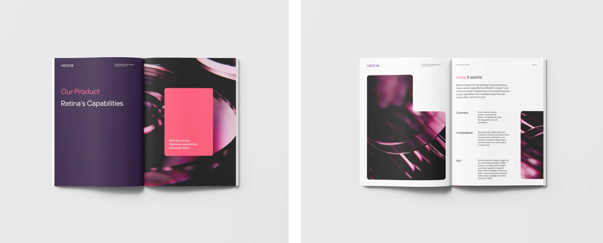
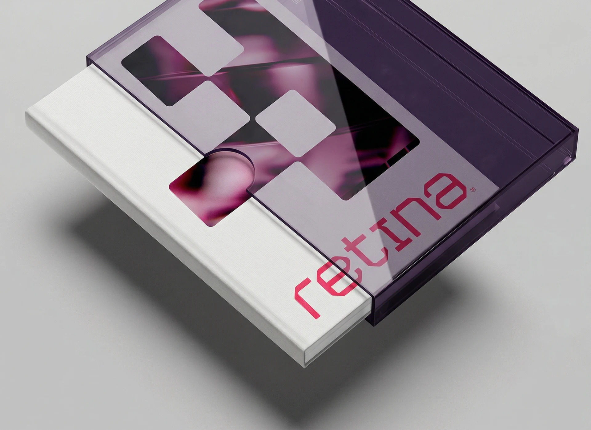
The solution was constraint as refinement. Rather than force the digital aesthetic into print, new shapes derived from the logo became containers for the photography, turning full-bleed chaos into focal points. Patterns emerged from the same language. Layouts became tighter, cleaner. The result feels more grounded and high-end - still technical, still Retina, but organized and concise. The brand didn't soften; it matured.
What seemed like a production limitation became a design strength. Print became the lever that made the whole system feel more intentional.
Senior brand production & rollout
Graphic design
Document & digital applications
Collaborated with Chief Design Director
Worked within brand guidelines as part of the team